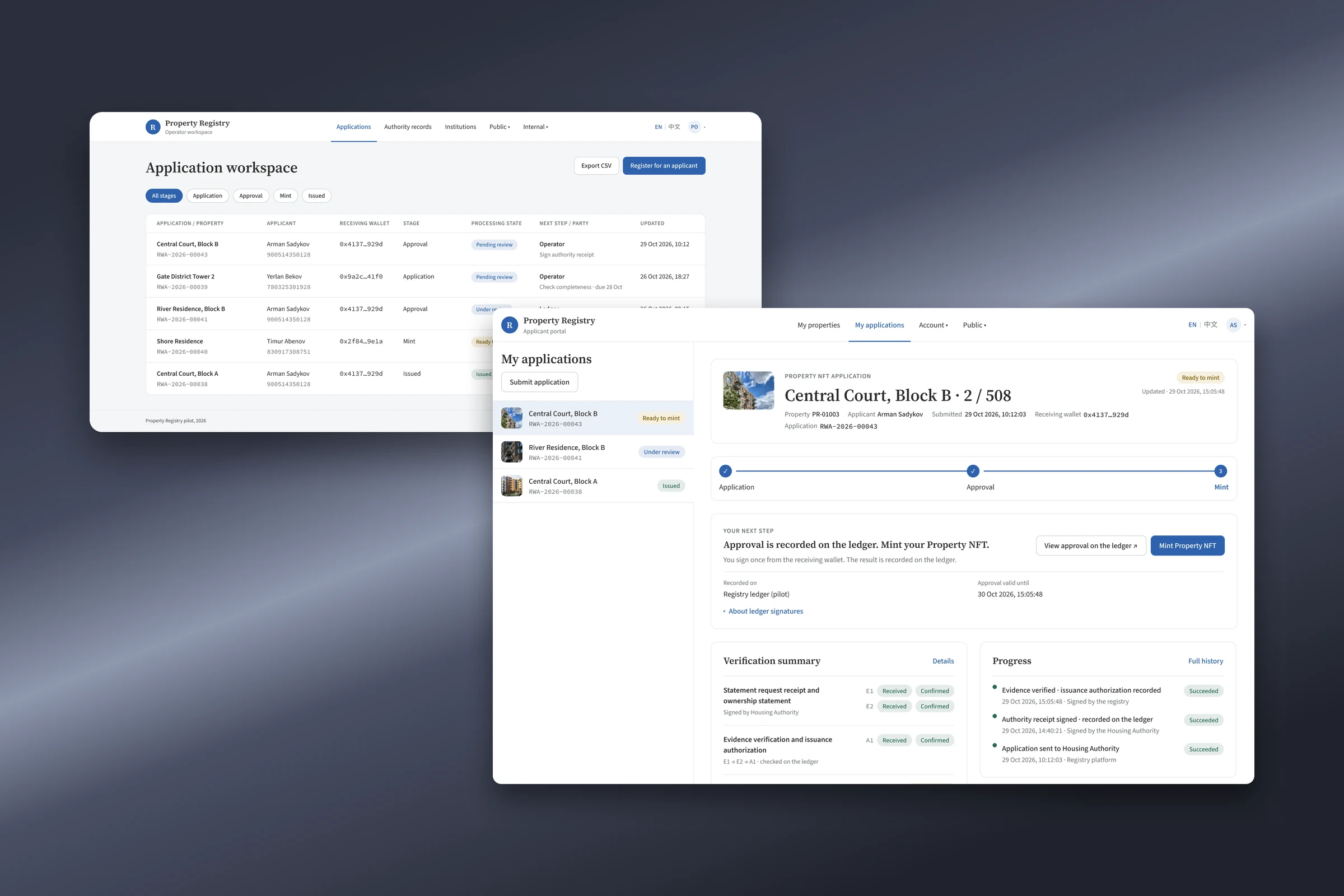
02 · The goal
Officials should be able to use the registry on their own
I was asked to revamp the design of a property registry, so that government staff could understand the platform and use it on their own. Through a thorough design audit of the current system, I found this was not a UI issue but a flow issue: people couldn't tell what to do next, so I redesigned the flow, not just the screens.
Owners apply for a certificate of their property, an official approves it for the Housing Authority, and anyone can check it. The certificate is an NFT: a digital token kept in a crypto wallet.
Between the owner's portal and the official's workspace, the system lives in the backend. Personal data stays with the Housing Authority; the system keeps only signed proofs, on a shared record that shows any change. The officials judging the registry rarely knew what an NFT was. They cared that each department keeps its data and every step can be traced.
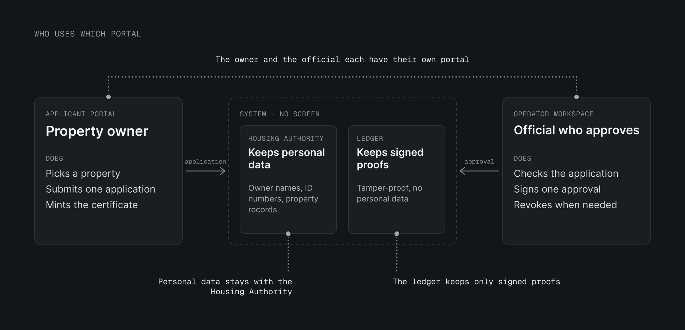
02 · The goal
Officials should be able to use the registry on their own
- I was asked to revamp the design of a property registry, so that government staff could understand the platform and use it on their own.
- A design audit showed it was not a UI issue but a flow issue: people couldn't tell what to do next.
- Owners apply for a certificate of their property, an official approves it for the Housing Authority, and anyone can check it.
03 · Design audit
Owners couldn't find where to apply; officials had nothing to approve
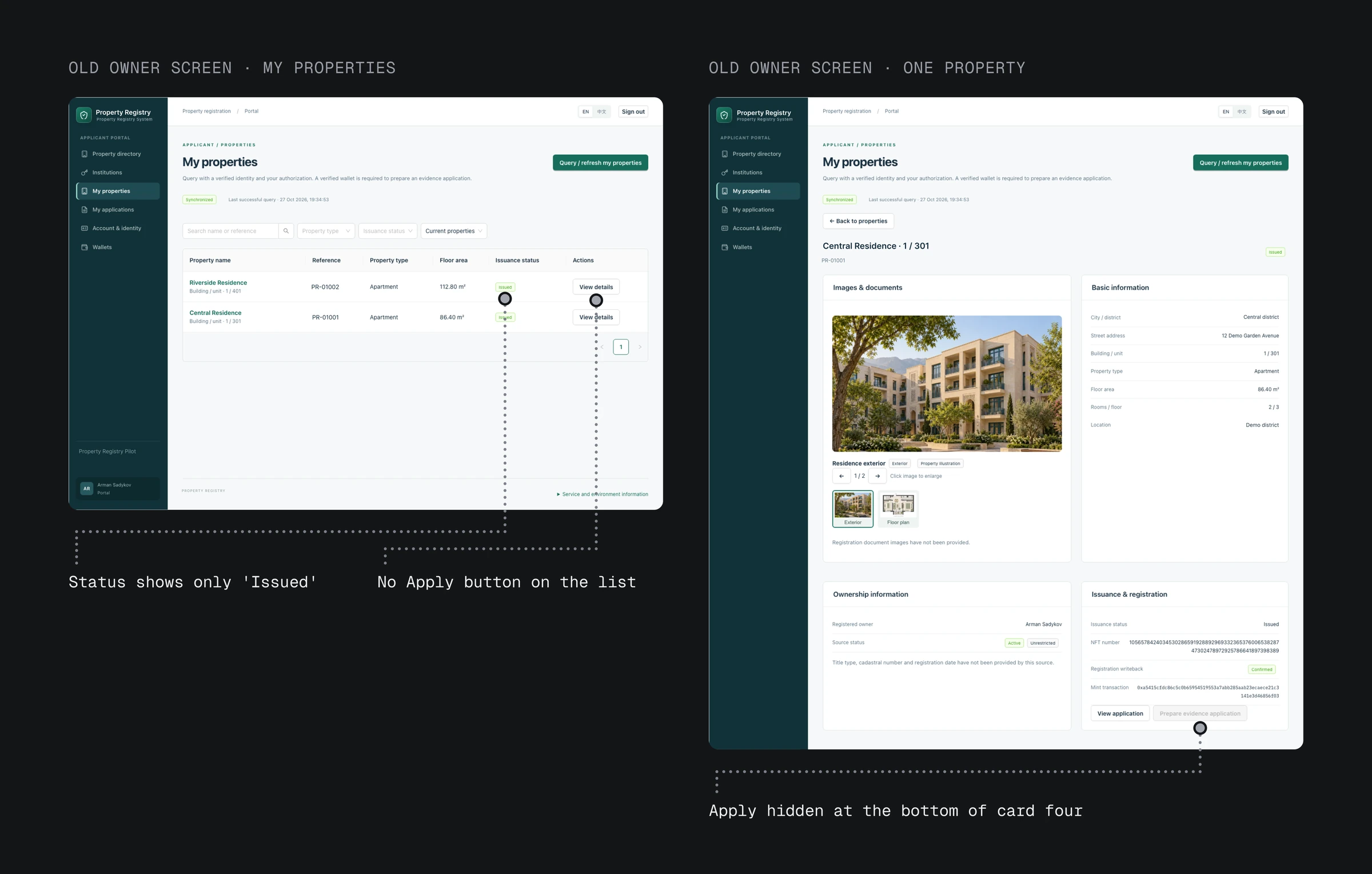
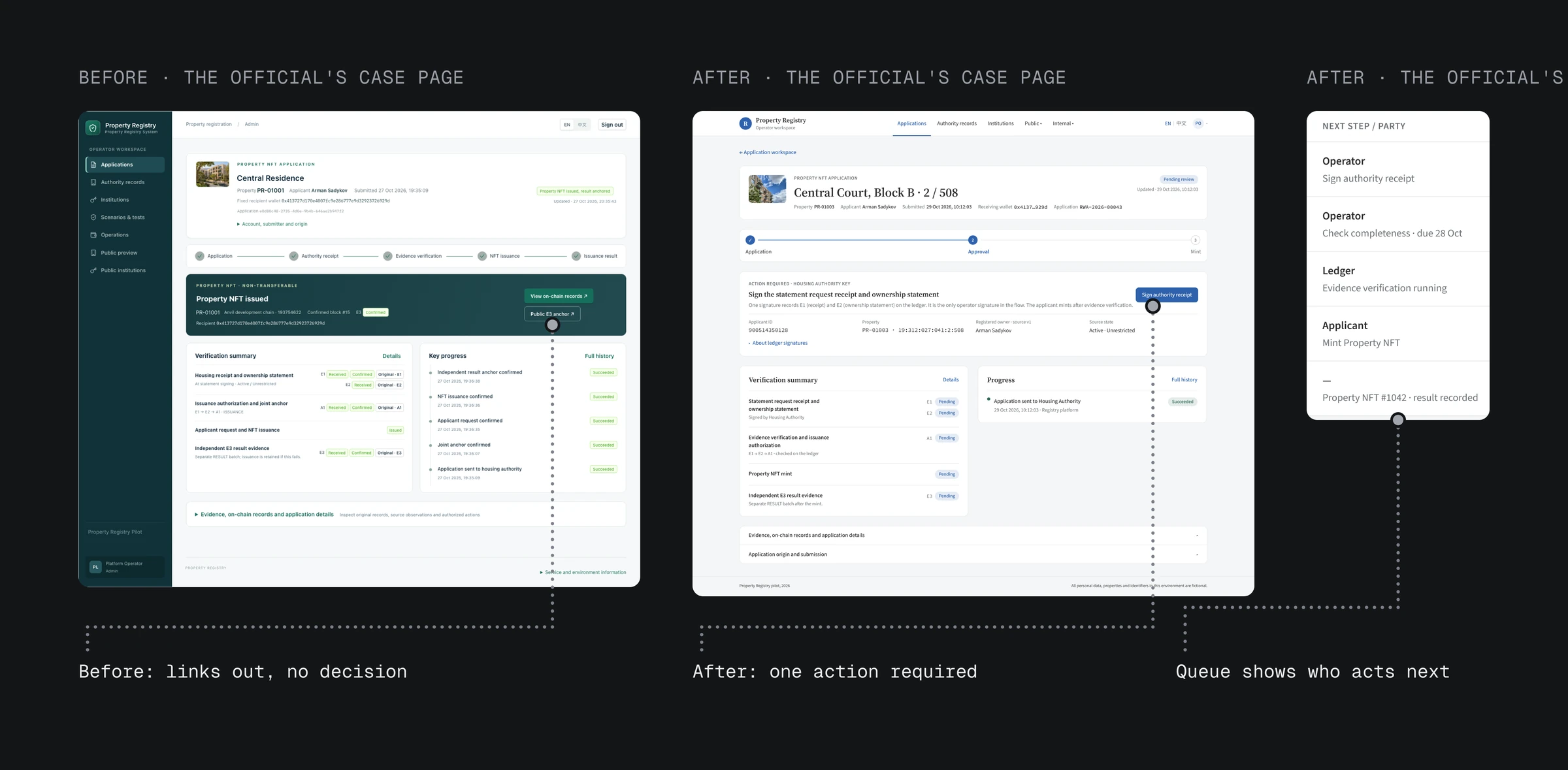
The previous design followed the system's work, so neither the owner nor the official could clearly see what to do next. The property list had no Apply button, and its only status was "Issued". The way in was a grey button at the bottom of the fourth card on a detail page.
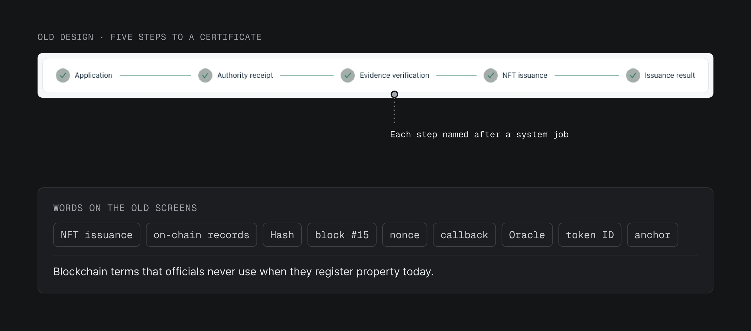
Getting from an application to the certificate took five steps, each named after a system job: Application, Authority receipt, Evidence verification, NFT issuance and Issuance result. Screens showed hashes, block numbers and "nonce", which officials couldn't match to how property is registered today.
Officials had no clear task either. Their list of applications showed "View property NFT / None" as the next step, and no application page had an Approve button.
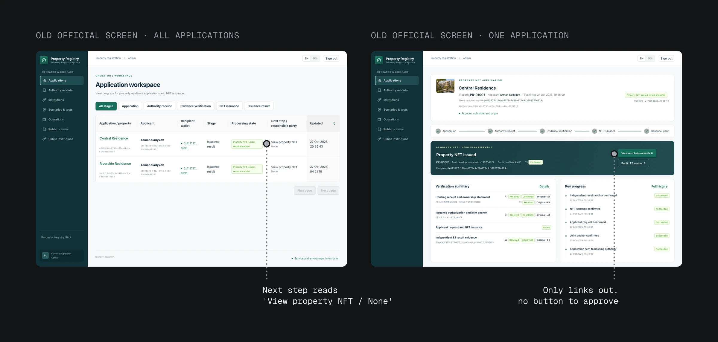
03 · Design audit
Owners couldn't find where to apply; officials had nothing to approve
- The previous design followed the system's work, so neither the owner nor the official could clearly see what to do next.
- The property list had no Apply button; the way in was a grey button on a detail page.
- The five steps were named after system jobs, and no application page had an Approve button.
04 · Insight
A streamlined workflow, with a clear next action for each side
The owner and the official make every decision; the system's job is to check and record. So the flow follows what each person does: the owner applies, the official approves, the owner claims the certificate. The system's work shows as status inside those steps, which match what people know from paper: apply, get approved, collect.
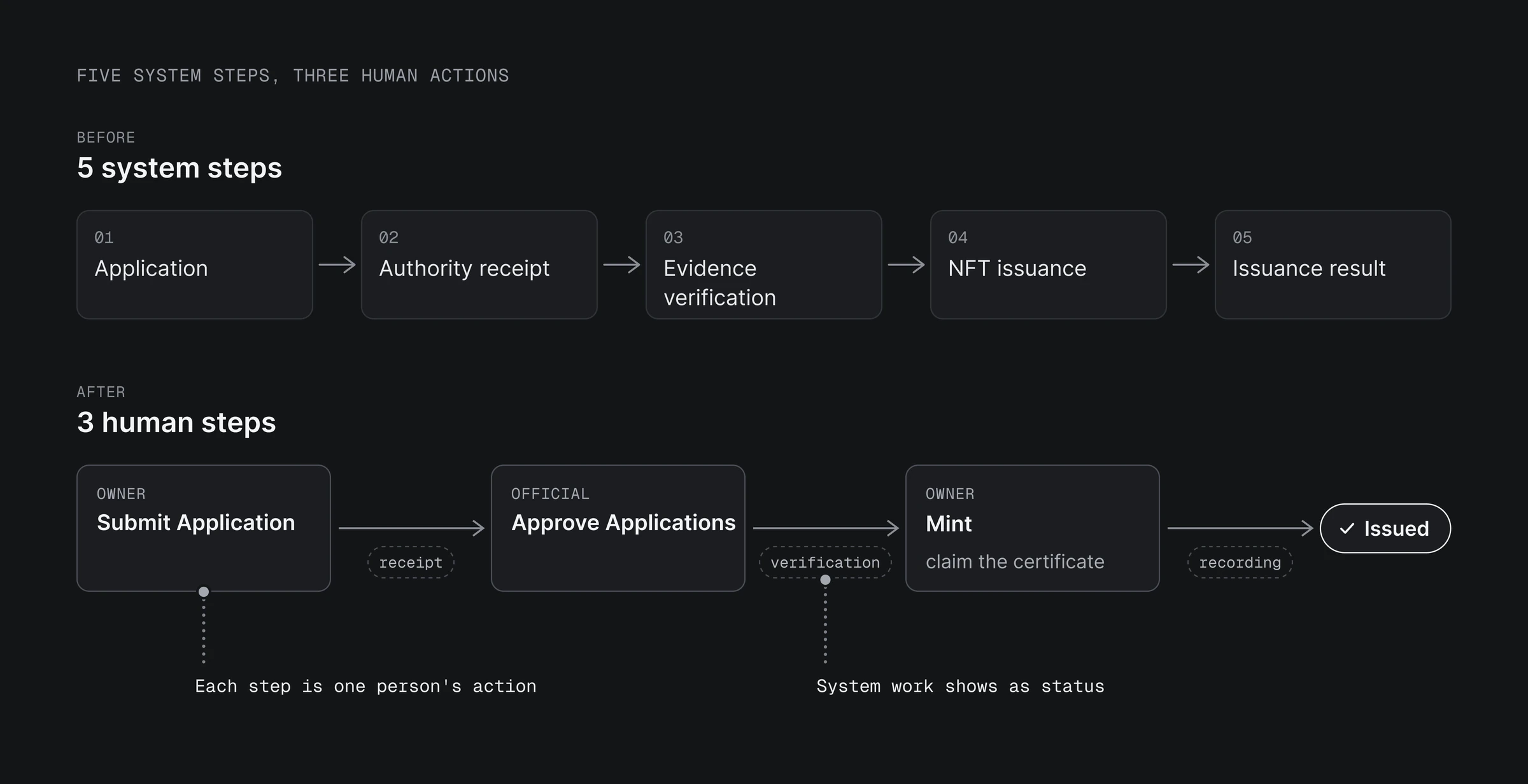
04 · Insight
A streamlined workflow, with a clear next action for each side
- The owner and the official make every decision; the system's job is to check and record.
- So the flow follows what each person does: the owner applies, the official approves, the owner claims the certificate.
05 · New flow
The owner applies, the official approves, the owner claims
The new flow has three steps, one for each thing a person does: the owner applies, the official approves, and the owner claims the certificate. I weighed it against two simpler versions. Keeping the old five steps without jargon still left steps where nobody does anything, so the owner just waits. Cutting to two steps, where approval sends the certificate straight to the owner's wallet, would put something in the wallet the owner never agreed to. Three steps avoid both.
On screen the steps are Submit Application, Approve Applications and Mint. "Mint" stays on the button because it is the action the owner signs, so one technical word remains.
Every property shows its status and the next step
Every property now shows its status, and one that hasn't been applied for offers "Apply" on its card. "Submit application" also sits above the list of applications.
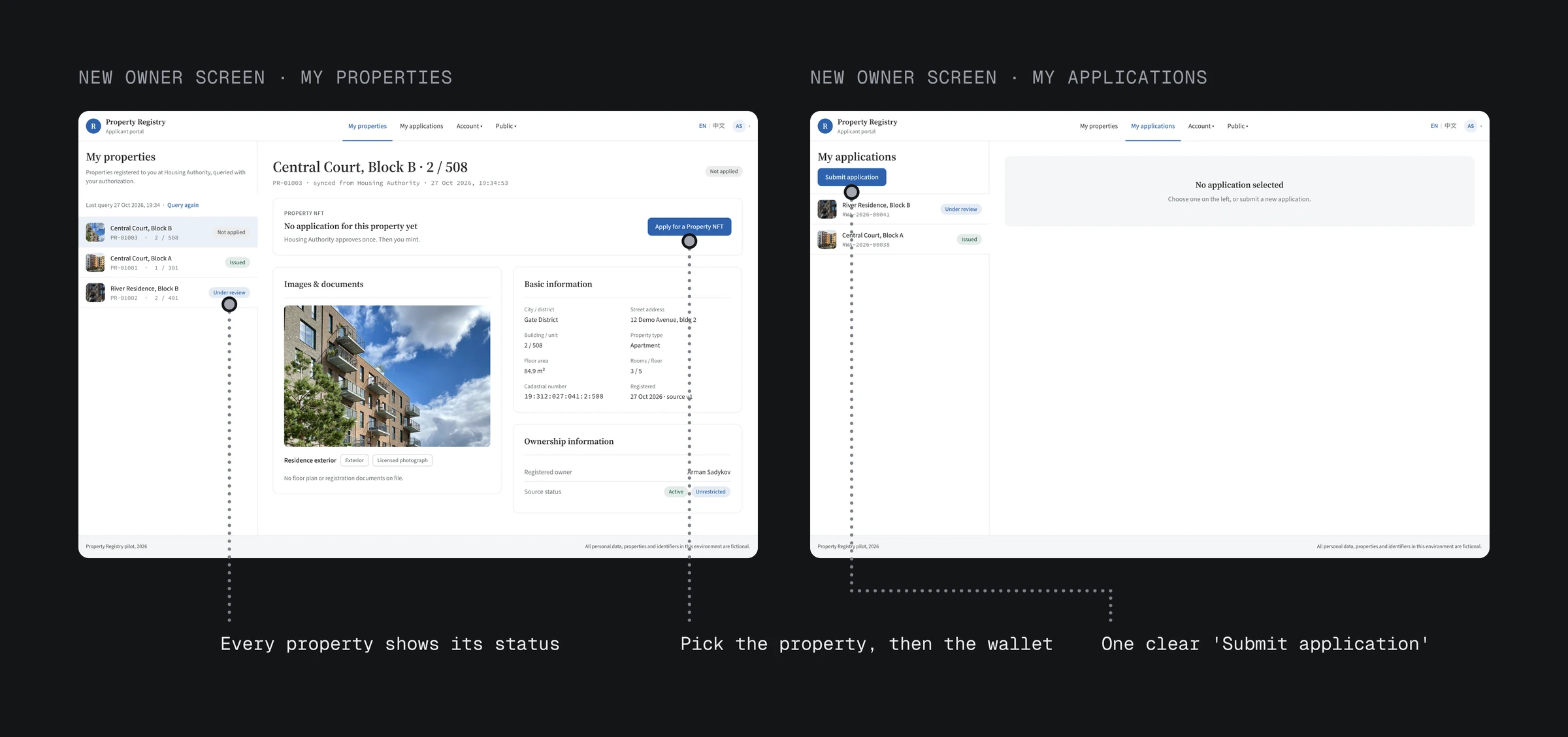
Each state names who acts: "Next step: Housing Authority. Nothing to do on your side." If claiming the certificate fails, nothing is created and the approval still stands, so the owner can try again.
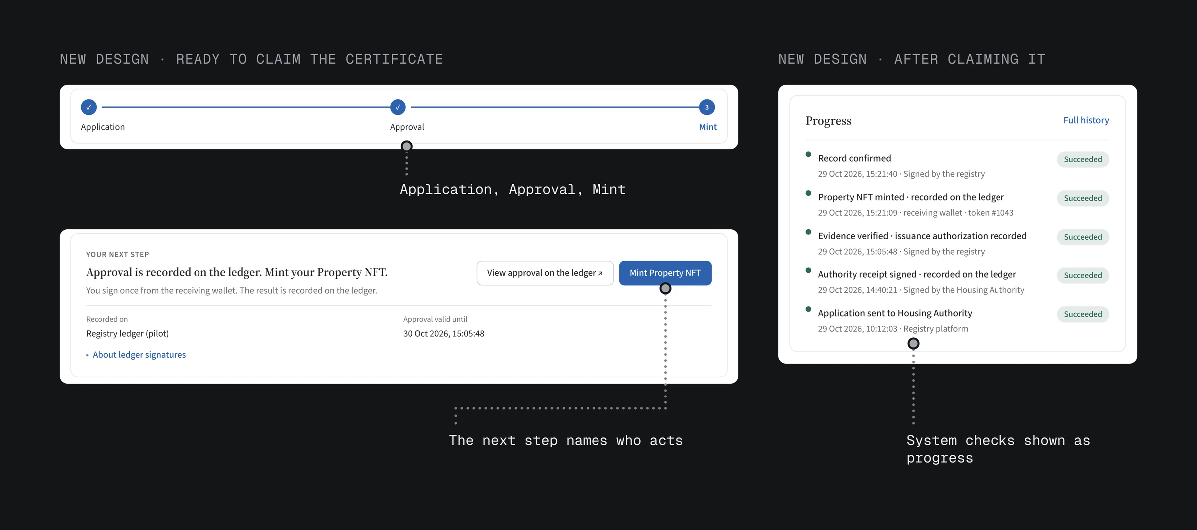
A simpler workflow for the official: one approval instead of two signatures
The previous flow asked the official to sign twice: for the receipt, and for the evidence check the system runs. Now the official signs once, and the platform signs the evidence check and shows it as progress. Each progress row names who signed, official or platform, and when.
05 · New flow
The owner applies, the official approves, the owner claims
Decision 1
Every property shows its status and the next step
- What
- Every property now shows its status, and one that hasn't been applied for offers "Apply" on its card.
Decision 2
A simpler workflow for the official: one approval instead of two signatures
- What
- Now the official signs once, and the platform signs the evidence check and shows it as progress.
06 · Lifecycle
The previous design had no certificate lifecycle, so I designed one
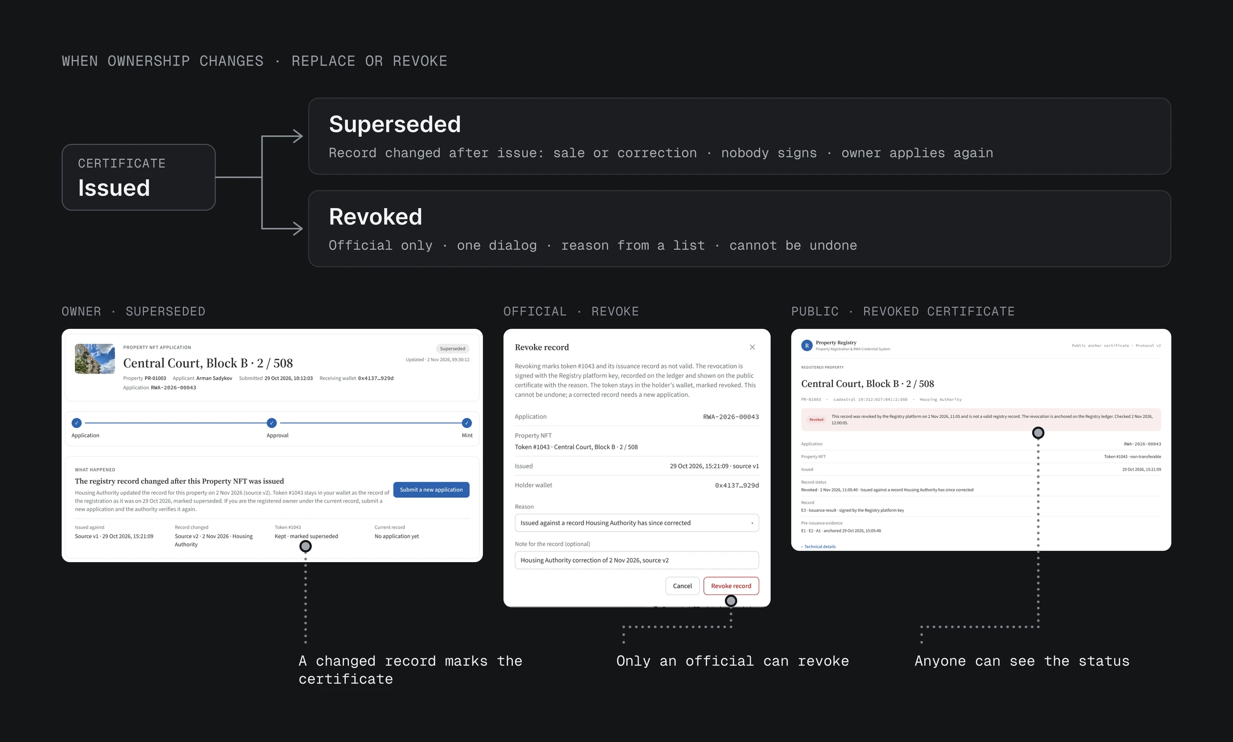
The previous design stopped at "Issued", but property is sold and records get corrected. Nothing said what a certificate becomes after that, so I mapped its whole life. The test: each certificate should match one owner and one approval. Moving the certificate to the new owner would break that, because no official approves the new owner. Marking it as replaced, with the new owner applying again, keeps it, so a sale or a correction replaces the certificate.
The lifecycle: Issued, then Replaced or Revoked, with a public status anyone can check.
- Replaced: when the Housing Authority's record changes, the certificate is marked as replaced, and the owner sees "Submit a new application".
- Revoked: only an official can revoke, in one dialog, with a reason from a fixed list. It cannot be undone.
- Public status: the public certificate shows its current state to anyone.
Until a new owner applies, the public page shows only the replaced certificate.
06 · Lifecycle
The previous design had no certificate lifecycle, so I designed one
- The previous design stopped at "Issued", but property is sold and records get corrected.
- The lifecycle: Issued, then Replaced or Revoked, with a public status anyone can check.
07 · Result
A streamlined workflow for owners and officials
Five system steps became three human ones, each with one person's action. The official signs once instead of twice, so signatures per application went from four to three.
For now the official can only approve. I left rejecting and asking for more documents off on purpose: branches the product didn't have would hide the one real action. They are next to design.
What I'd measure in a pilot: time from submit to certificate, how many owners apply without help, and how many cases wait on the official.
Engineers split work into the steps they build; people think in the steps they take. My job was to translate one into the other, and keep a record of what the system does behind each step.
07 · Result
A streamlined workflow for owners and officials
- Five system steps became three human ones, each with one person's action. The official signs once instead of twice, so signatures per application went from four to three.
- What I'd measure in a pilot: time from submit to certificate, how many owners apply without help, and how many cases wait on the official.